
What 5 things make a great business dashboard?
In today’s data-centric world, the ability to deliver and consume insights effectively is paramount for businesses. A Business Dashboard, when well-crafted, serve as the central hub for data insights, offering both a quick overview and detailed analysis of essential metrics, trends, and actionable information.
This article outlines five essential practices for building an informative analytics business dashboard, transforming yours from static chart aggregator into a dynamic tool that empowers decision-makers.
Planning Your Business Dashboard Data Story
The primary goal of a business dashboard is to narrate a compelling data story. To achieve this, start by understanding your audience and defining clear objectives that align with their needs. Once the objectives are set, identify the relevant metrics and KPIs that support them. Finally, devise an engaging and comprehensible presentation format for these critical insights.
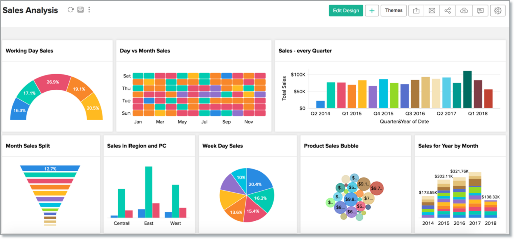
Planning your data story is a crucial step in creating an effective analytics dashboard. It involves structuring the information on your dashboard in a way that conveys a clear and compelling narrative.
Here’s how you can plan your data story in 10 simple steps:
- Start by identifying the primary objectives of your dashboard. What questions or problems should it address? What insights are you trying to convey?
- Consider your audience. Who will be using the dashboard, and what are their needs and expectations?
- Select the key performance indicators (KPIs) and metrics that align with your objectives. These should be the most relevant and important data points.
- Avoid data overload. Including too many metrics can overwhelm users and dilute the focus of your story.
- Structure your data logically. Group related metrics together to create a cohesive narrative.
- Use clear and concise labels and titles for each section of your dashboard. Make it easy for users to understand the context of the data.
- Arrange your data in a logical sequence that guides users through the story. Start with an overview and gradually delve into details.
- Consider using visual cues like arrows or numbering to indicate the flow.
- Identify the key insights or takeaways from the data. What do the numbers and trends reveal about your business?
- Use visualisations like charts and graphs to highlight these insights effectively.
- Contextual information is essential. Include explanations, benchmarks, and comparisons to help users interpret the data.
- Consider adding annotations or callouts to draw attention to specific points of interest.
- Avoid clutter and unnecessary complexity. Simplicity often leads to better understanding.
- Use a clean and uncluttered design that focuses on the most critical information.
- Before finalising your dashboard, test it with potential users or stakeholders. Gather feedback and make improvements based on their input.
- Be prepared to iterate and refine your data story as needed.
- Regularly review and update your dashboard to ensure it remains relevant to your business objectives and the needs of your audience.
Incorporate storytelling elements into your data presentation. Use narratives, anecdotes, or scenarios to make the data relatable and memorable.
By carefully planning your data story, you can create a business dashboard that not only presents information but also tells a compelling narrative that helps users make informed decisions and take meaningful actions.
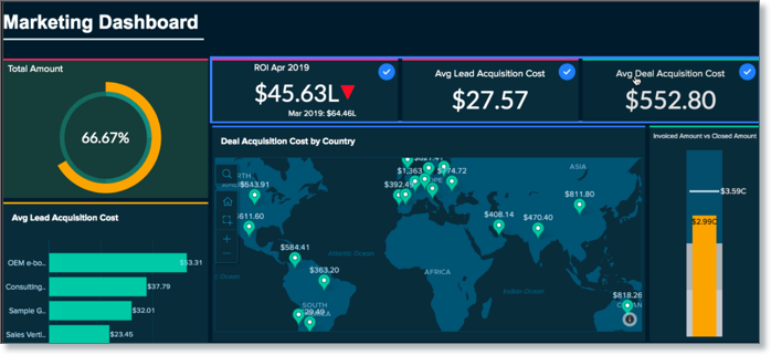
Make Your Business Dashboard Interactive
A well-organised dashboard goes beyond structured insights. It allows users to interact with data flexibly, enabling ad-hoc analysis for agile decision-making. Modern BI platforms offer various capabilities for users to explore data independently and uncover deeper insights.
Making your business dashboard interactive is essential to engage users and enable them to explore data on their terms.
Here are some strategies to make your dashboard interactive:
More data, more accessible
| Drill-Down and Drill-Through | Allow users to click on charts or data points to access more detailed information. For example, clicking on a specific bar in a bar chart can reveal a breakdown of data for that category. |
| Filters and Parameters | Incorporate filters that enable users to customise the data they see. Users can select date ranges, regions, products, or any other relevant criteria to refine the dashboard’s content. |
| Interactive Charts and Graphs | Use interactive chart types like line charts, scatter plots, or heatmaps that respond to user interactions. Users can hover over data points to see values or click to zoom in on specific data ranges. |
| Dashboard Interactions | Create interactions between different elements of your dashboard. For example, selecting a specific region on a map could filter data in a related chart to show only data for that region. |
| Highlighting and Selection | Implement highlighting effects when users hover over or select data points. This provides immediate feedback and focuses the user’s attention. |
| Mobile Optimisation | Ensure that your dashboard is responsive and optimised for mobile devices, making it easy for users to interact with the data on the go. |
More features, more use
| Tooltips | Include tooltips that display additional information when users hover over data points or elements. Tooltips can explain abbreviations, provide context, or offer data source details. |
| Interactive Filters | Use interactive widgets like sliders, dropdowns, or buttons for users to change settings or apply filters. These widgets should instantly update the displayed data. |
| Export and Download Options | Offer options for users to export data or visualisations in various formats (e.g., PDF, Excel, CSV). This allows users to take the data with them for further analysis. |
| Search and Searchable Dropdowns | Include a search feature that lets users quickly find specific data points or items within large datasets. Searchable dropdowns are especially useful for selecting items from long lists. |
| Dynamic Dashboards | Create dashboards with dynamic content that updates in real-time or based on user inputs. For example, a dashboard can display live stock market data that refreshes every few seconds. |
More functionality, more help
| Collaborative Features | If the dashboard is meant for collaboration, incorporate features like commenting, sharing, or real-time editing to facilitate discussions and decision-making among users. |
| Guided Analytics | Include guided tours or wizards that walk users through the dashboard’s features and functionalities, especially if it’s their first time using it. |
| User Training and Help | Provide resources such as tutorials, tooltips, or FAQs within the dashboard to help users understand how to interact with the data effectively. |
Remember that the level of interactivity should align with your users’ needs and technical expertise. Some users may prefer a simple, intuitive interface, while others may require advanced interactive features to perform in-depth analysis. It’s essential to strike a balance that meets the diverse needs of your dashboard’s audience
Augment your business dashboard with AI
The rapid advancements in AI offer automation for complex analytics operations while ensuring accuracy. AI capabilities in BI platforms democratise analytics, making it accessible to users with minimal technical expertise. Automated insights, as showcased below, provide instant valuable insights, kickstarting the decision-making process.
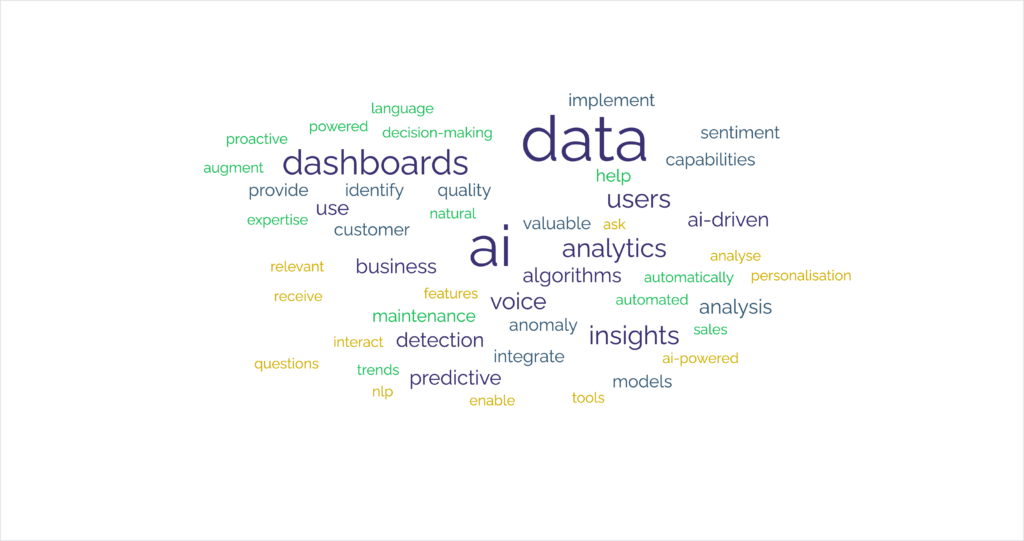
Augmenting your business dashboards with AI can significantly enhance their capabilities and provide more insightful and actionable information. Here’s 15 ideas of how you can integrate AI into your dashboards:
Utilise AI-driven algorithms to automatically generate insights from your data. AI can identify trends, anomalies, and correlations that may not be immediately apparent to human users.
Implement predictive models powered by AI to forecast future trends, such as sales projections, customer churn rates, or inventory demand. These predictions can assist in proactive decision-making.
Integrate NLP capabilities into your dashboard to enable users to interact with data using natural language queries. Users can ask questions like “What were last month’s sales in the Eastern region?” and receive relevant visualisations.
Use AI algorithms to automatically classify and cluster data. This can be useful for organising and visualising large datasets, especially unstructured or semi-structured data.
AI-powered anomaly detection algorithms can identify unusual patterns or outliers in your data. This is valuable for fraud detection, quality control, and monitoring system performance.
Incorporate sentiment analysis tools that use AI to analyse text data (e.g., customer reviews or social media comments). This can provide insights into customer satisfaction and brand sentiment.
Implement AI-driven personalisation features in your dashboard. Tailor the content and recommendations based on the user’s role, preferences, and historical interactions with the dashboard.
Embed chatbots or virtual assistants powered by AI into your dashboard. Users can interact with these bots to ask questions, receive data, or perform tasks within the dashboard.
If your data includes images or videos, use AI algorithms for image recognition and video analysis. This can be valuable in industries like healthcare, manufacturing, and e-commerce.
AI can help improve data quality by identifying and rectifying inconsistencies, duplicates, and missing values. Clean data is essential for accurate analytics.
For businesses with physical assets (e.g., machinery), AI-driven predictive maintenance models can help predict when equipment is likely to fail, enabling proactive maintenance.
Enable voice commands for your dashboard, allowing users to verbally request data or initiate actions. Voice analytics can also analyse voice data for insights.
Implement recommendation engines that suggest relevant actions or content based on the user’s behaviour and historical data.
AI models can continuously learn from new data. Ensure that your AI-powered features are designed to adapt and improve over time.
Use AI for security purposes, such as anomaly detection for cybersecurity threats. Ensure compliance with data protection regulations by incorporating AI-driven data governance tools.
To successfully augment your business dashboards with AI, you’ll likely need the expertise of data scientists, AI engineers, or AI-focused software vendors. They can help identify the most suitable AI solutions for your specific business needs and integrate them seamlessly into your dashboard environment.
Get creative with your business dashboard
We turned to Dean Hodges, Director of our creative sister company, Gold Pebble, to help give us some great insights to help get creative with business dashboards.
Unleash creativity in your dashboards to captivate your audience. By employing colours, themes, and layouts strategically, you can draw attention to specific insights while maintaining brand consistency. Incorporating creative elements like text, images, videos, and multimedia components enhances dashboard comprehension and engagement.
Here are some creative ideas to consider when designing your dashboards to ensure they are engaging while still relaying critical information.

Use Colour Psychology
Leverage colour psychology to evoke emotions and convey messages. For example, use green for positive metrics, red for negative ones, and blue for neutrality. Not only does this make the data more easy to read quickly, it reinforces what each metric means for business success. However, use this carefully and ensure colour choices align with your brand’s identity.
Consistent Branding
Maintain brand consistency by incorporating your company’s logo, fonts, and colour palette into the dashboard design. This reinforces your brand identity and fosters recognition. Furthermore it is another reminder to viewers of the importance of brand identity.
Storytelling with Data
Craft a narrative using data. Guide users through a story that unfolds as they interact with the dashboard. Use annotations and commentary to explain the significance of data points. This approach reminds them they are not just looking at a data set – it reflects the perspective of the business at any given time.
Create a dashboard storyboard that outlines the flow of information and interactions. This helps in planning the dashboard’s structure and storytelling.
Creative Typography
Experiment with typography to create emphasis. Use different fonts, sizes, and styles for headings, titles, and data labels. Be consistent with typography choices to maintain readability but use the differences to help viewers understand the importance of different parts of the data.
Iconography
Integrate icons and symbols to represent data categories or concepts. Icons can simplify complex information and make it more visually appealing. As a result your viewers will remain engaged for longer and be able to keep up with the understanding required to interpret all the information in your dashboard.
Data Visualisation Techniques
Explore unconventional data visualisation methods like word clouds, sankey diagrams, treemaps, or chord diagrams. Choose the visualisation that best suits the data you’re presenting, making it easier to understand at-a-glance the overall picture. Once you have incorporated a particular method make sure you repeat it for consistency and think wisely if you ever consider changing it!
Infographics
Incorporate infographics or mini-infographics within your dashboard. These visual summaries can quickly convey complex information. The contrast of widgets, diagrams, table and infographics really help keep viewers interested and reduces the amount of time people need to take complex concepts onboard.
Interactive Elements
Add interactive elements like clickable buttons, sliders, or hover effects to engage users. These elements can trigger actions or display additional information. Remember dashboards hold different information for different roles and responsibilities and some viewers may need to drill down to find out more. Frequently an anomaly in data, or a sudden change from the norm might require more research to understand why – being able to interrogate data is crucial to compelling, functional and most importantly usable dashboards!
User Personas
Design with specific user personas in mind. Consider the preferences and needs of different user groups when creating dashboards for various departments or roles. These User Personas can be the basis for each individual tailoring their dashboard to their own specific needs.
Furthermore, gather feedback from users and incorporate their suggestions into the dashboard’s design. User-focused design ensures that the dashboard meets their needs.
White Space
Don’t overcrowd your dashboard with information. Utilise white space effectively to enhance readability and focus on essential data.
Gamification Elements
Gamify your dashboard by adding elements like progress bars, achievements, or badges. This can motivate users to explore data and achieve specific goals.
Experiment and Iterate
Don’t be afraid to experiment with different creative elements and layouts. Continuously test and iterate based on user feedback to improve the dashboard’s effectiveness.
Remember that creativity should enhance the dashboard’s functionality, not hinder it. Ensure that creative elements serve a purpose and contribute to a better understanding of the data. Balance creativity with usability to create dashboards that captivate your audience while delivering valuable insights.
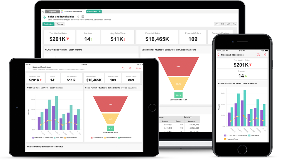
Allow your business dashboard to flourish on all form factors
In today’s mobile-driven world, designing for various devices is essential. Your Business Dashboard should be accessible across devices, prioritising relevant capabilities for each channel. For instance, mobile dashboards focus on real-time alerts and on-the-go decision-making, while desktop versions offer in-depth analytics and advanced features for comprehensive analysis.
Simplify your layouts, build in drill downs, allow personalisation and focus on your narrative to allow all users to get the picture – whatever they are looking at it on!
Business Dashboards, in conclusion… (for now)
Implementing these best practices empowers organisations to transform their dashboards into powerful decision-making tools. Empowering decision-makers with informative dashboards is key to success in today’s data-driven landscape.
However, what is right for you for today may not be right for the future as your business grows, it is a great practice to keep refining and adding to your business dashboards to ensure they continue to deliver the crucial data you need to drive your business’ essential Data-Driven Decision-Making.